Dedicated to high quality labels and personalized service
Custom label solutions
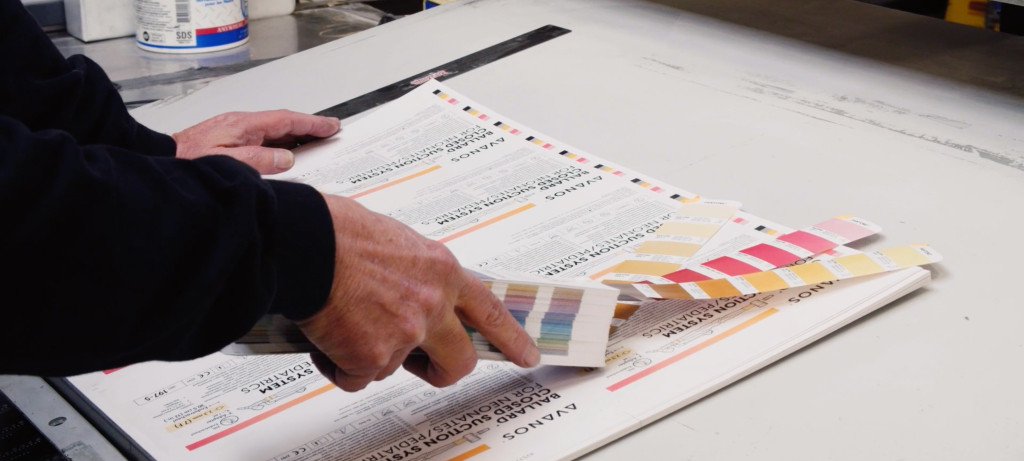
The benefits of printing your labels with Advanced Labels include reliability, convenience, and much more: we offer affordable prime labels, quick turnaround, multiple SKUs, private label packaging, label prototypes, seasonal orders and promotional labels. Our focus is always on you, your strict delivery requirements and your need for competitive pricing.


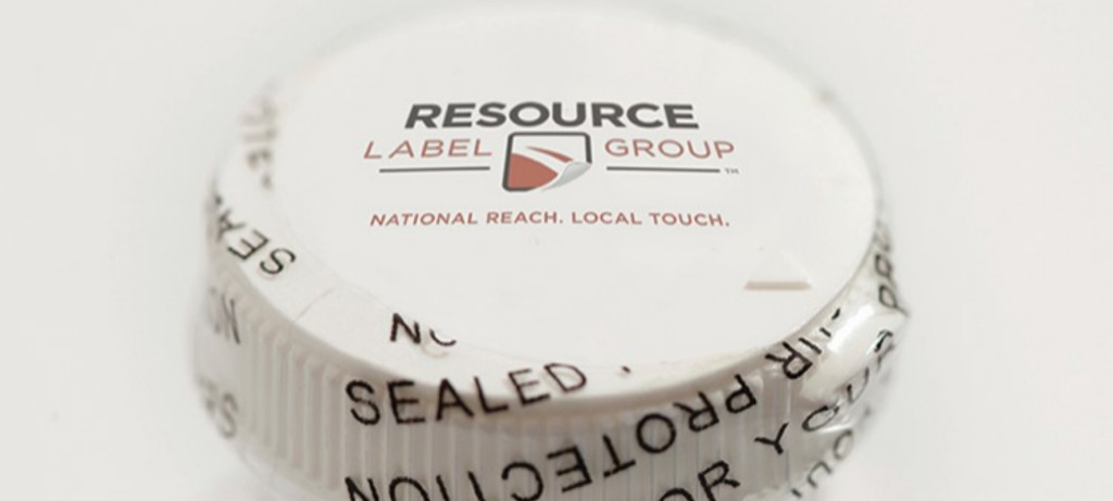
We’re a part of the resource label group family
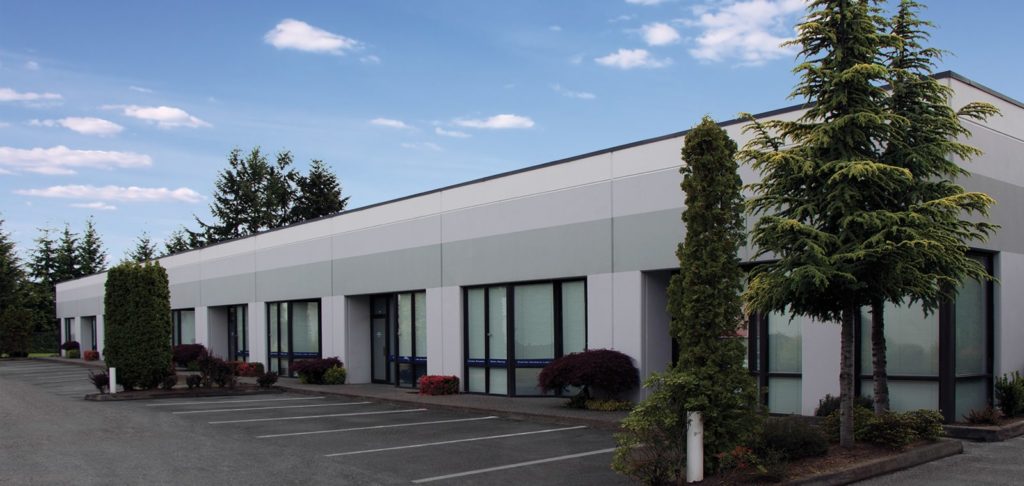
When you work with Resource Label Group, you’re gaining an efficient edge over the competition. With locations throughout the U.S. and Canada, we provide the capabilities and reach you’d expect from a national company, with the dedication and touch of a local partner.

Capabilities
What we do
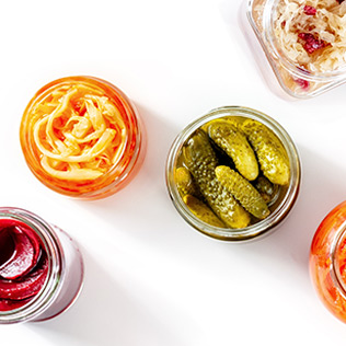
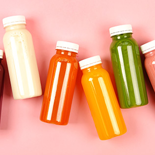
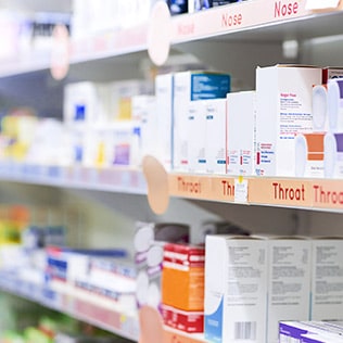
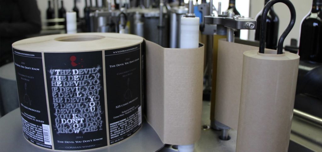
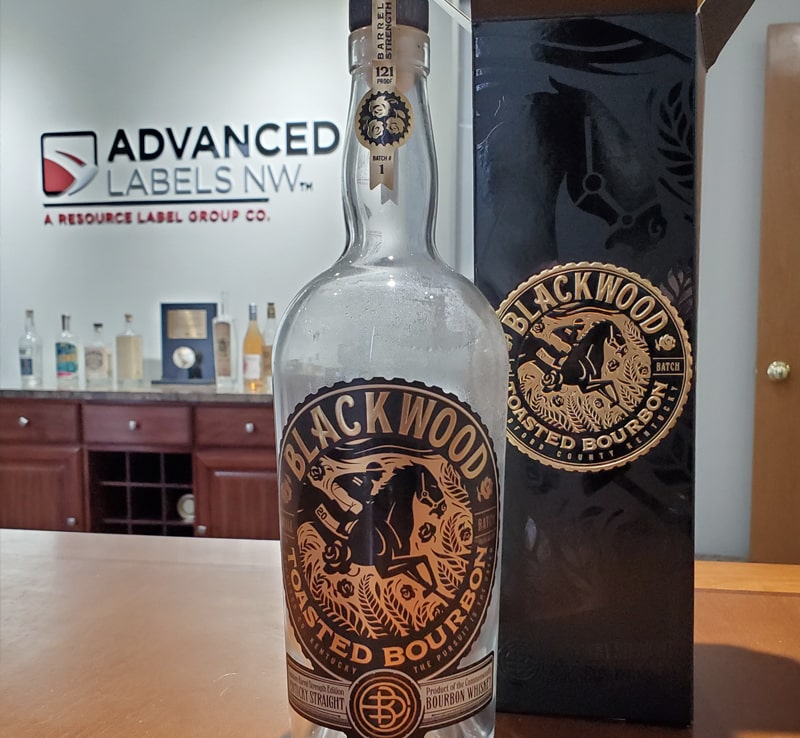
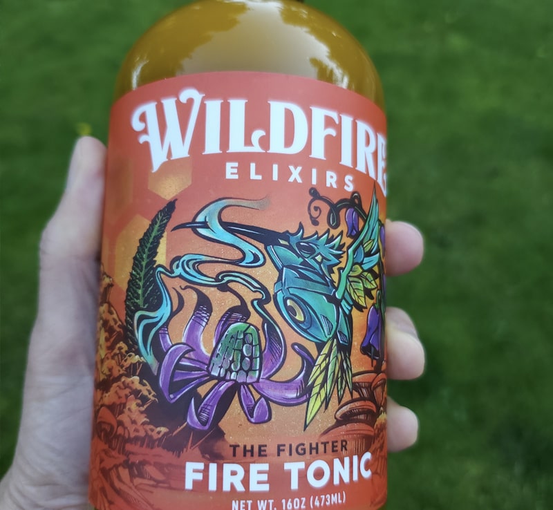
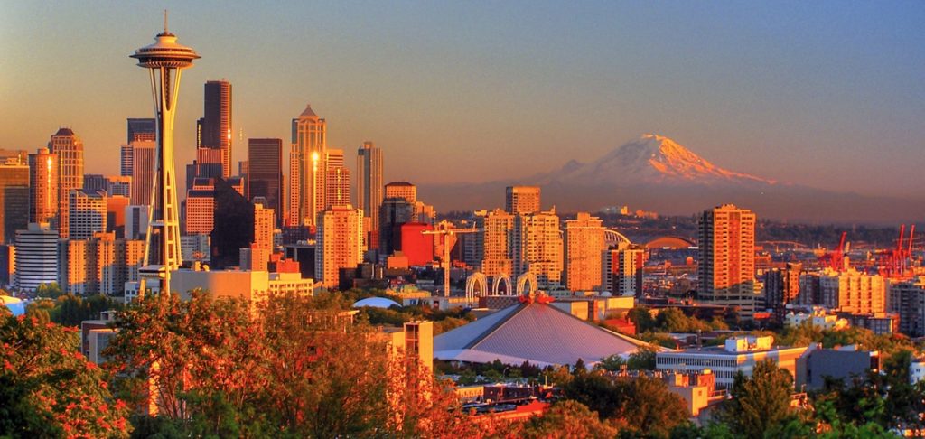
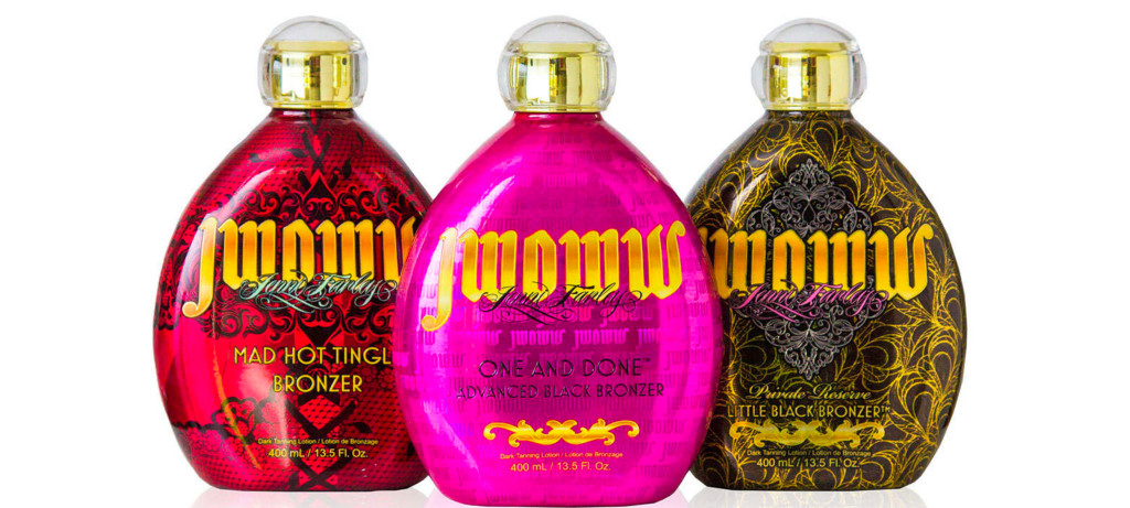
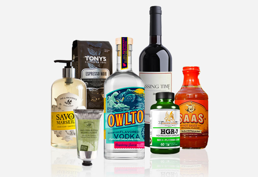
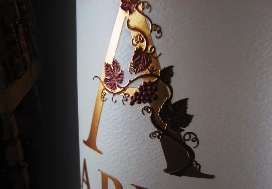
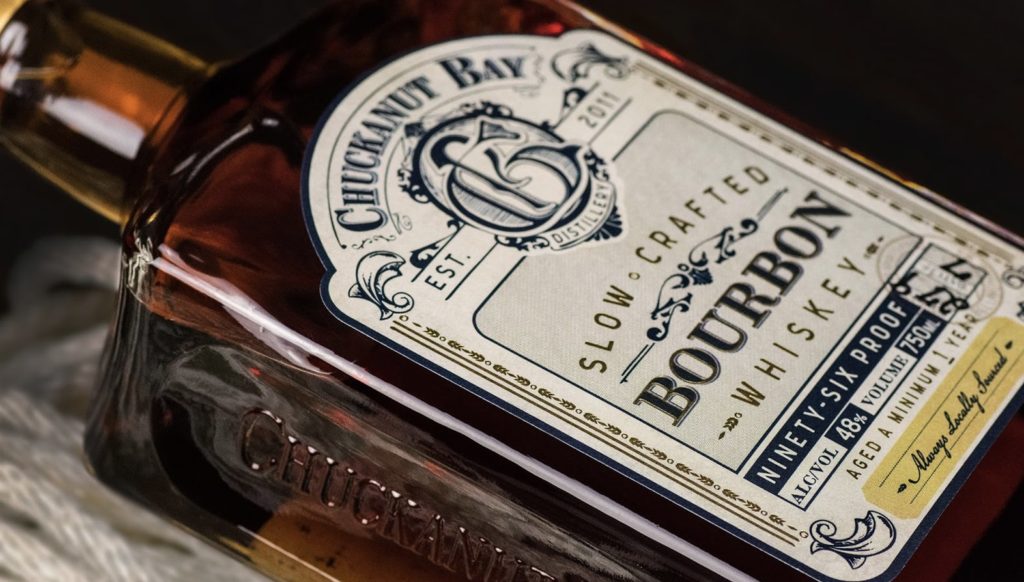
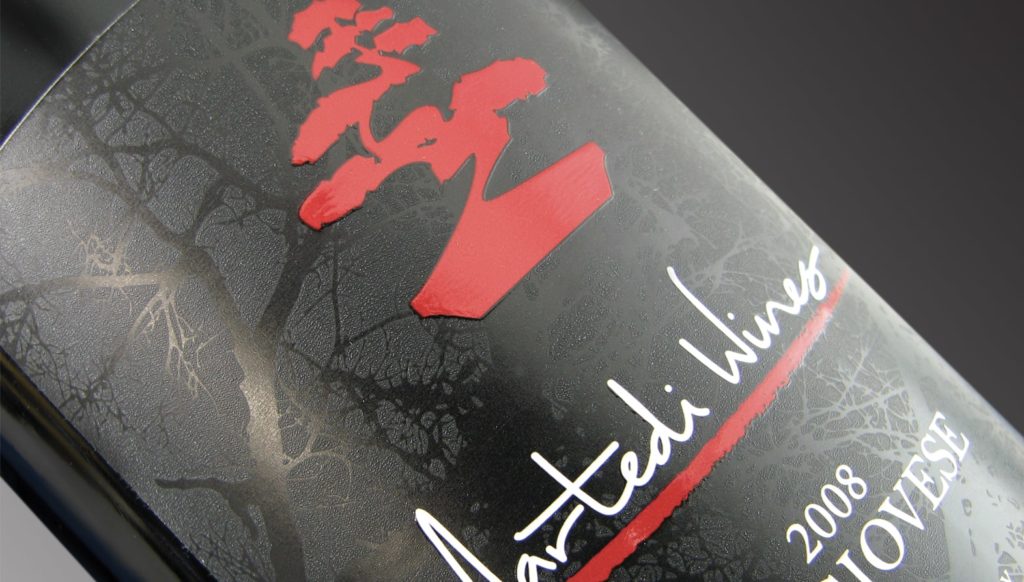
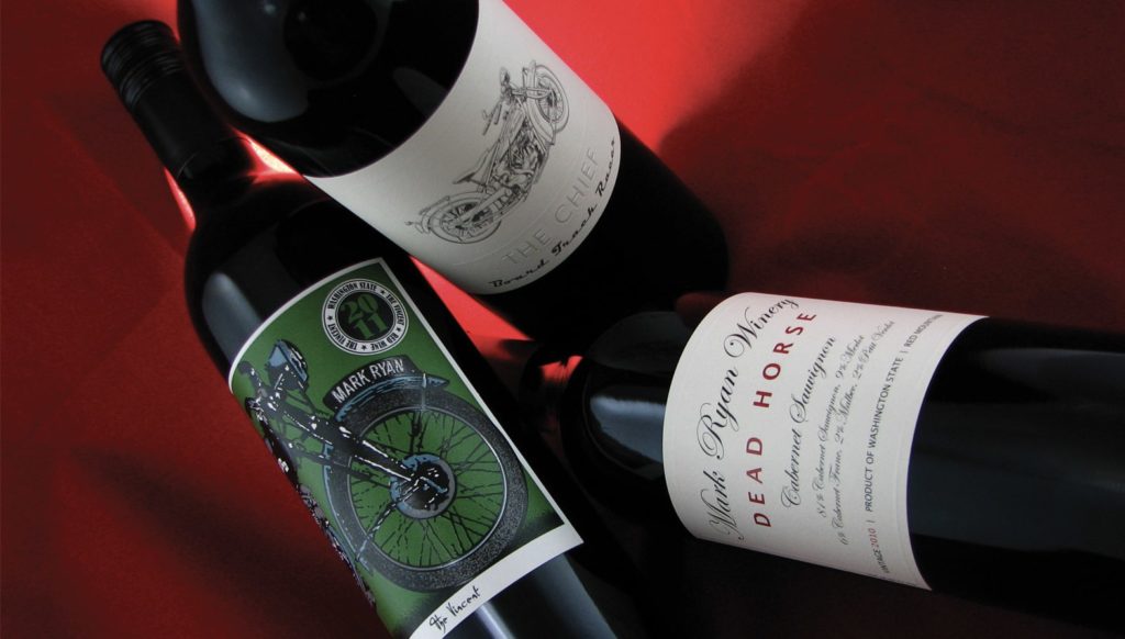
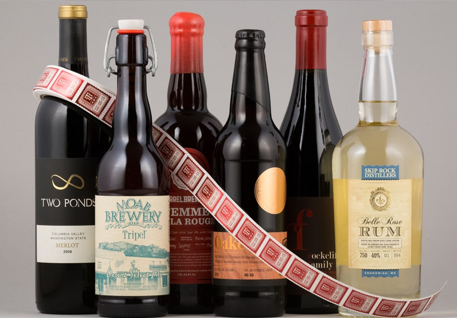
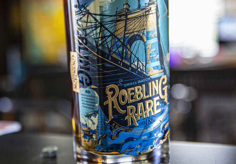
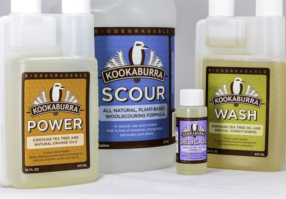
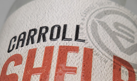
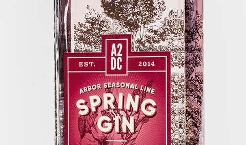
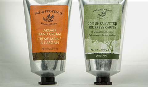
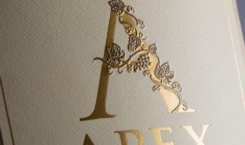
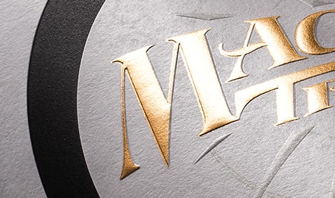
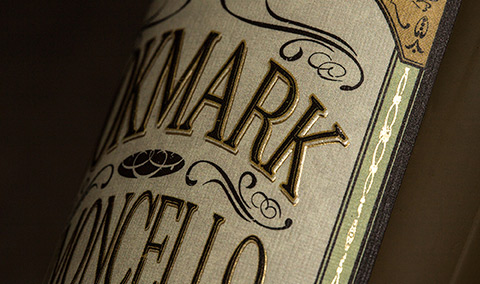
Elegant wine labels, spirit labels, vitamin and nutraceutical labels, bath and beauty labels, and specialty bottle labels are just a few of our popular capabilities. We are a preferred custom label printer of Washington wine labels and produce labels for brands all over the country from our Seattle area headquarters. We will guide your label order from beginning to end.

Markets
We know the nuances of our industry.
Our expert teams offer in-depth insights into market trends and regulations.